WordPress Block Plugin
Every Screen Its Own Settings
The block editor gives you one alignment, one font size, one padding value — for every screen size. Responsive Controls adds tablet and mobile overrides for alignment, visibility, typography, spacing, layout, order, and sticky offsets, right in the block sidebar.
Scroll
3
Breakpoints
20+
Controls Per Device
6
Core Blocks Extended
100%
Free & GPL Licensed
What’s Included
Responsive controls that feel like they were always there
Desktop stays exactly as you designed it. Responsive Controls adds separate tablet and mobile settings to core blocks, so every screen size gets the layout it deserves, with no custom CSS and no media queries.

Responsive Text Alignment
Set left, center, right, or justified text separately for tablet and mobile. Buttons blocks re-align their buttons, not just the text.
Responsive Visibility
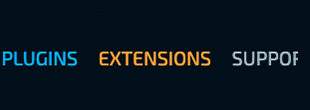
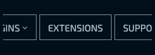
Hide any supported block on desktop, tablet, or mobile — independently, in any combination.
Responsive Typography
Font family, size, appearance, line height, letter spacing, decoration, and letter case — each with its own tablet and mobile value, using your theme’s presets.

Responsive Padding & Margin
Tablet and mobile padding on all four sides, plus top and bottom margin, using the same spacing presets as the native Dimensions panel.
Responsive Block Spacing
Tighten or loosen the space between inner blocks per device. Works with Group, Columns, Column, and Buttons, whatever their layout.
Group Direction & Justification
Turn a Row into a Stack on mobile (or the other way around), and change justification and wrapping per device.
Columns Stacking & Reverse Order
Stack columns on tablet, and reverse the order when they stack, so the image in an image/text layout can come first on small screens.
Responsive Order
Move a block earlier or later inside its row, stack, grid, or columns on tablet and mobile without duplicating content.
Sticky Offsets
When a block is set to Sticky, set its top/bottom and left/right offsets separately for desktop, tablet, and mobile.
Full Width Flex Fix
One toggle to make alignment work when a block sits inside a flex container, per device.
Native WordPress Controls
Built from the same components WordPress uses in its own sidebar, so it looks and works like the rest of the editor.
Theme Presets Built In
Font families, font sizes, and spacing sizes come from your theme’s theme.json, so overrides stay on-brand.
Why this exists
It looks perfect on your monitor Then you pick up your phone
The headline is centered. The padding is generous. The columns sit side by side exactly as designed. Then you open the page on a phone — and that left-aligned paragraph looks lost, the 120px of padding eats half the screen, and the image you wanted on top ends up at the bottom.
The block editor only gives you one value for each setting, on every screen. So you add a custom class, open the theme’s stylesheet, and write a media query. Then another for tablet. Then the client edits the page, the class disappears, and you write it again.
We wondered why something as basic as “center this on mobile” needs custom CSS. So we built the controls into the block editor itself — saved with the block, scoped to that block, and independent of your theme.
Download
Free All of it
No Pro version, no locked features, no license keys. Every control is included.
Free
$0
Forever Free · WordPress.org
No Pro version, no locked features, no license keys. Every control is included.
- Responsive text alignment
- Responsive visibility (desktop, tablet, mobile)
- Tablet & mobile typography
- Tablet & mobile padding, margin, and block spacing
- Group direction, justification, and wrap
- Columns stacking and reverse order
- Responsive order
- Sticky offsets for all three breakpoints
- Full width flex fix
FAQ
Common questions
Does this work with any WordPress theme?
Yes. It extends core WordPress blocks, so it works with block themes and with classic themes wherever you use the block editor.
Will it conflict with my theme’s styles?
Unlikely. Each block’s responsive styles are scoped to a unique class for that block only, and only apply inside the matching breakpoint.
Does it require a page builder?
No. Everything lives in the native WordPress block editor sidebar.
What WordPress version do I need?
WordPress 6.5 or higher and PHP 7.4 or higher.
Is it really free?
Yes, every feature. There’s no Pro version.
Can I use it on client sites?
Yes. It’s GPL licensed, so you can use it on unlimited sites.